Self-Awareness as a Public Servant

close up photo of droplets on glass

In an attempt to practice ethical statistics, one must first identify the potential barriers that might come into play. We’ve learned from our fearless leader, Prof. Justin Longo, that good statistical practice is based on a) transparent assumptions, b) reproducible results, and c) valid interpretations. With that understanding, let’s quickly break this down:

A) Transparent Assumptions
Policy Analysts owe the policy process and the weight of their policy recommendations, a full acknowledgment of their personal biases and the assumptions that might come out of those. This is also a helpful practice for life. How are the biases and assumptions that you hold as an individual, going to affect the ways you interpret or present data? I’ve heard it explained that our minds often act as Press Secretaries, reorienting incoming information to confirm what we already believe. That is why we must rely on evidence stemming from . . .

B) Reproducible Results
Reproducibility is a part of good scientific practice. The more we are able to test a hypothesis and come to the same result, the more we know our thesis is sound. If a piece of evidence shows that it could not be reproduced, based on population, location, or any other number of variables, it might not be worth including in our presented analysis. Linked to this is . . .

C) Valid Interpretations
After research is compiled, and the data is processed, we must interpret the results. This is where it’s most likely for our biases to take over. If we allow our preference to hold importance over the factual data we’ve collected, a manipulated interpretation might occur. In this instance, we ask ourselves: What if decision makers take our advice based on how we’ve presented the data? Are we comfortable with this presentation being taken to action?

Policy analysis is a personal act that may require some measure of de-personalization in order to be effective. Awareness of this necessity may just be the basis of success in public service.

Photo by Longxiang Qian on Pexels.com

An argument for cross-provincial Policy comparison.

In exploring the data presented as a part of Tableau Desktop, I was drawn to the information related to obesity. The data set breaks down into related subsets including percentage of the adult population that smokes, has diabetes, shows high levels of inactivity, and more unexpectedly, the experience of child poverty and food insecurity. As an undergraduate student of psychology, I understand that low-income, food security, and physical health are closely linked. Fresh food is more expensive, and subsequently less attainable to those in a low socio-economic system. It is much more feasible to buy 500 calories of potato chips than 500 calories of fresh vegetables. My first step was to look at the regional differences in well-being, as described by the measures provided. I looked at regional levels of adult obesity, children experiencing poverty, food insecurity, and physical inactivity. The regions described are North-East, Midwest, West and South. Far beyond all other regions, the Southern states experience higher levels of all measured indicators than the other regions. The visual below shows the stark difference between the South and other regions.

Screen Shot 2019-12-04 at 6.29.25 PM

I narrowed my information to the Southern region for each indicator and discovered a striking consistency.

Screen Shot 2019-12-04 at 6.29.46 PMScreen Shot 2019-12-04 at 6.30.34 PMScreen Shot 2019-12-04 at 6.30.48 PM

Screen Shot 2019-12-04 at 6.31.10 PM
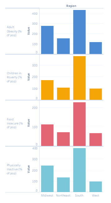
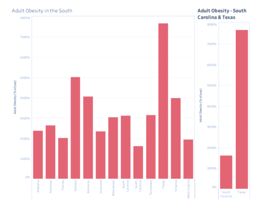
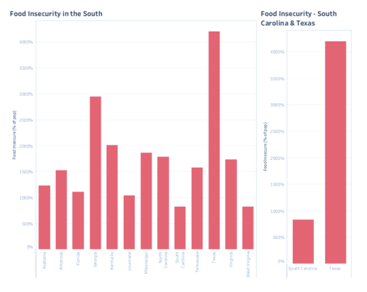
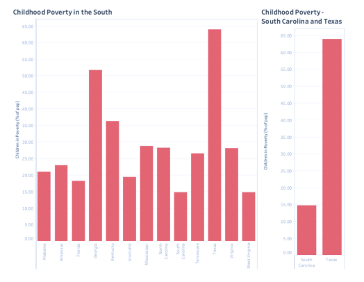
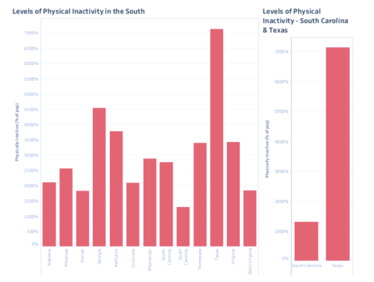
In all four indicators, Texas experiences the highest level and South Carolina experiences the lowest. In the case of Food Insecurity, Texas experiences well over four times what South Carolina does. Margins on the other indicators are no less drastic.

Screen Shot 2019-12-04 at 6.31.23 PM
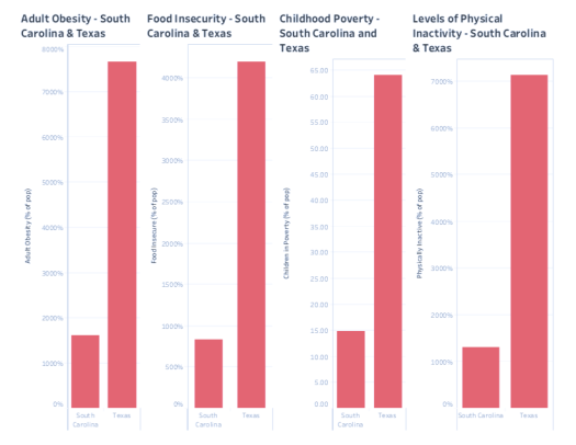
This led me to ask the difference between the states. There are the obvious differences. Texas, in land mass, is more than eight times the size of South Carolina and five times the population. Both Texas and South Carolina have coastlines, but South Carolina borders the Atlantic Ocean, while Texas borders the Gulf of Mexico. The economic opportunities stemming from these coasts would be dramatically different. So, controlling for these differences, why does Texas experience such a dramatically different rate of obesity, child poverty, food scarcity, and inactivity?

I don’t have an answer. The answer available to me is buried in a level of research far beyond what is required of this assignment. Rather, I use this example to present the necessity of cross-state, or in Canada’s case, cross-provincial comparison for the purpose of policy development and formation. In this case, a policy analyst might question if South Carolina offers any physical activity incentives as a part of their state tax program. A policy analyst might also question the height of child poverty in Texas and look at a number of other regional states to find differences in social policy.

My argument is to not let the more obvious differences between these two states account for all of the differences between them. This screams of willful arrogance as a result of terminal uniqueness. We can always learn from each other and must value the policy decisions of other governments as the resource that they are.

Indexes! What are they good for?

architecture buildings europe houses

Let’s say you have a big question. A question that involves so much data that it would take a lifetime to sort your way to the answer. Say you want to know about the winter health of the most Northern European Countries over the course of a decade. You’re considering moving to Norway but are concerned about how people in this northern country experience Seasonal Affective Disorder (SAD), given the long periods of cold and darkness. But it’s not just Norway. It’s Sweden and Finland and Denmark and Belarus! How are those countries affected by Seasonal Affective Disorder? As you’re thinking about the indicators that could give you a picture of this, you would like information about the rates of substance abuse, percentage of the population that are prescribed anti-depressants, and the number of public programs or media campaigns aimed at addressing the issue. This seems like an impossible ask. It’s too specific and there’s no way that anyone is gathering data on this issue, right? Wrong.

The United Nations Development Programme created the Human Development Index to compile data in a way that would give us a worldwide view of areas of human development – i.e. the capabilities of that country’s citizens to function. The dimensions of the index are a Long and Healthy Life, Knowledge, and Standard of Living. The dimensions break down into indicators, and then into dimension indexes. This index as a whole, is massive, and would require a specific field to be valuable to anyone individually. The value of Indexes, however – especially for a policy administration sphere – cannot be underestimated.

Going back to our first example. Assuming the existence of a Winter Wellness Index for northern Europe, what if Finland has a declining rate of those prescribed antidepressants as compared to Norway, whose rate is static? This could indicate a policy measure that has been created to combat this. Perhaps the government authorized a rebate on the citizen purchase of SAD lamps and outdoor recreation fees. In any case, this may lead to further investigation and implementation of different policy measures for your purposes. Indexes allow us to look, broad picture, at what other people are doing or not doing that is affecting the way the measured population lives. It also allows us to see anomalies, issues, and gaps more quickly than if we were unable to look at the data as a whole, and in a comparative manner.

scenic view of mountains

I’ve heard more than once about massive data dumps – often the result of well-meaning social programs – that have never and will never be processed. Perhaps if we considered the bird’s eye view, we’d see more value in that data. Sometimes you have to climb the tree to see the forest.

Photo by Pixabay on Pexels.com

Photo by KML on Pexels.com

Probability Problems.

person riding a bicycle during rainy day

It’s not unfair to say that we often make decisions based on statistics that we don’t understand. But it’s not – entirely – our fault. The popularization of certain types of probability statements and the desire for sensational headlines – without due process of explaining these terms or phrases – leads to widespread misunderstanding. This leads us to disregard statistics and probability statements because ‘they don’t mean anything,’ or at the very least, they don’t provide the information they’re meant to. Nevertheless, we need these numbers. The very first thing we need is a heightened understanding of what they even mean.

Say you want to build a house in an undeveloped area. You might go to your local archive and do some research on your future backyard. You learn that this plot of land sits on a 100-year floodplain. You might think, great! I certainly won’t be living here for the next 100 years, so I’m more probably than not, in the clear! What this probability statement actually means is that each year, there is a 1 in 100 chance of a flood occurring in that area. Over the course of the average mortgage, the land surrounding your house then has a 26% chance of being flooded at least once. This kind of understanding should affect the way you approach the decision to purchase flood insurance.

This applies, perhaps even more so, to the arena of policy discussions and decision making. We need statistics and statements of probability. They provide a level of scope that can’t be observed another way. The way we use and understand these statistics, however, needs revision. Those in public service need to seek out a more thorough understanding of statistics and probability statements as they inform decision making. Researchers and data analysts should also be prepared to present the information that will provide this understanding. The wider the understanding of a probability statement, the less likely misinformation will be spread and popularized.

For more on this topic, check out this article by Nate Silver! It really brings this idea home.

Photo by Genaro Servín on Pexels.com

Simulations and Allllll of us!

I have always said that the minute Uber comes to my city I will become a driver. The gig economy was made for me. I’ve always lived with multiple streams of income – side hustles if you will – and I’m not alone. Millions of millenials, in working to accept the reality that working full time is not enough, are taking on side-hustles – or second part time jobs – to save, reduce debt, or just pay rent. Driving a car around downtown wherever on a Saturday night might seem like an easy way to bring in some extra cash, but I was directed to this simulation game that lets you test if you really have what it takes to make it in the gig economy.

First. Friends. This game is LEGIT The Oregon Trail, but instead of dying from dysentery, you end up not making your mortgage payment. I’ll tell you this. It’s not that I’m questioning my ability to succeed in the gig economy, it’s that I’m unclear if I want to participate in a sector of the gig economy with as many variables as ride-for-hire.

The simulator starts and challenges you to earn enough in one week to pay your $1000 mortgage payment. I figured, no big deal. I was wrong. Big, hard deal.

Screen Shot 2019-10-26 at 5.47.14 PM

At the end of my first day I’d spent nine hours sitting in my car and earned roughly what I’d make in two hours of my actual side hustle. Yikes. At some point in here I was asked if I’d like to attempt a Quest; complete a certain number of rides by a certain time and receive a bonus from Uber. This was a no-brainer. I accepted the challenge.

Screen Shot 2019-10-26 at 5.48.24 PM

Second day of the challenge, more of the same.

Screen Shot 2019-10-26 at 5.49.30 PM

End of day 3, I was asked if I wanted to stay up a little longer to clean the car. I’m a hard worker – at least in this simulation – and so I did. At this point, I’d also achieved a 5 star rating, which was very temporarily good for my ego.

Screen Shot 2019-10-26 at 5.50.04 PMScreen Shot 2019-10-26 at 5.50.20 PM

By the end of day 4, I’d crushed the Quest challenge, earned $208 in fares, and tucked my son into bed after helping him with his homework.

I got caught up in the game at this point and failed to take any screen shots, but let me tell you. My weekend was wild. Car repairs, vomiting riders I couldn’t say no to, no-idle-zone tickets, and by the end of the week . . .

Screen Shot 2019-10-26 at 5.54.32 PM

. . . I did not make my mortgage bill. A net $323!? Blarg.

Screen Shot 2019-10-26 at 5.54.55 PM

Plus, I took no days off, which is distinctly lacking in reality as I am apparently also a parent. Can I even triumph in my good foresight to buy a business license?

In my Policy Analysis class, I completed three assignments on the Ride-Share Industry and the legislation of it is complex. Drivers need support from their oversight companies, riders need protection and assurance of safety, oversight companies need to not get sued, etc. Governments need to think broadly but practically about this strong industry with immense benefit to the greater economy. They need to work as thoroughly as these drivers apparently have to in order to make any money.

If I were to recommend the creation of a simulation game to increase public awareness about a policy problem, it would be called “You Be A City Councillor: See How You Like It.” I live in Moose Jaw, SK. The City Council struggles with public trust on a number of levels. As a student of Public Administration, I see this lack of public trust through a different set of eyes. Residents of this city have no idea what it takes to manage it. They’re like teenagers who honestly think that there’s an endless supply of Doritos; just for them. They want all of the services at zero the cost. And costs are rising steadily. I’d like residents to enter that simulation with the same level of bravado that I entered the Uber game. It’s a hard job and mistakes get made, but if you understand the industry and what has to go into it to make it a success, you might just get a functioning municipality; or your mortgage payment.

Either one is a win.

Yours, Mine, and Ours: Open Government, Open Data.

Fun fact, reader! I wrote this blog post while passively watching Twilight: Breaking Dawn Part I. I remember being really impressed by the CGI used to make Bella look so emaciated by the vampire baby she’s gestating. Eight years later I’m less impressed. Moving on!

Every year, the University of Regina – in an effort to keep with the practices of Open Government – publishes the salaries of all employees making over $100 000. The purpose of making this data public is first and foremost transparency. As salaries are paid with public funds, we have a right to know how and where it’s being spent; especially when those salaries are more than twice the average individual income in Canada.  This post is going to draw out the actual significance of this document, and what these numbers tell us about the fiscal action of the University of Regina. There is something to be said for balancing the public’s right to the use of public funds, with an equal right to individual privacy. As such, we will also discuss the instances under which it would not be appropriate to post a person’s salary and the process through which that is determined.

If you’d like to take a look at the actual data in this document, I’ve included a link. What you’ll see in that document is the data as provided by the University of Regina, a spreadsheet of data measurements I completed to give readers and idea of what the numbers as a whole mean, as well as columns checking for errors and measuring growth. The original document lists staff and faculty members by last name, first name. It then shows the salaries received in 2018 and 2019. Some staff and faculty members receive administrative stipends or market supplements in addition to their annual salaries. These are listed in separate columns for 2018 and 2019. Finally, columns showing the total amount received for 2018 and 2019 are listed. In an effort to check for errors, I inserted a column beside the 2018 totals and the 2019 totals. I inserted a function which calculated the 2018 and 2019 totals and did a side by side comparison of the results. I discovered one error in row 201. The individual in this row, did not receive an administrative stipend or a market supplement for 2019. Thus, his total salary should have been the same in the salary column and the total 2019 column but was instead almost $4000 higher. This document accounts for 540 staff and faculty members. One inaccuracy does not give me any pause about the reliability or accuracy of the data.

Another point of interest is the blank cells in the 2018 and 2019 salary columns. Blank cells in the 2018 salary column indicate that those individuals earned more than $100 000 for the first time in 2019. The data shows 73 of these individuals. Blank cells in the 2019 salary column indicate that those individuals received either a reduction in salary from 2018 (thus placing them below the $100 000 threshold) or left the university. The data shows 36 of these individuals. It is difficult to determine the significance of this as there is no indication as to hiring practice, regular salary increase, firing, or natural departure.

Let’s take a look now at the summary statistics I completed to give us an understanding of the data as a whole. I first determined that if $100 000 is the base salary of this list, we need to know the maximum one person is receiving for their work with the University. The MAX function gave us $365 998 in 2018 and $388 025 in 2019. Understandably, the individual receiving this amount is Vianne Timmons, President of the University of Regina. I then completed measures of central tendency to determine the actual representation within this range. I had assumed that these calculations would show that the AVG function would show Vianne’s salary to be an anomaly when compared to the MEDIAN, but the discrepancy was smaller than I anticipated. The AVG salary shows as $135 473 in 2018 and $137 316 in 2018. The MEDIAN salary shows as $130 005 in 2018 and $131 972 in 2019. The AVG salary has a larger growth rate between the two years which might be explained through the 74 staff and faculty members that were added to the list in 2019. I also completed measurements of Standard Deviation and Mean Absolute Deviation. I wasn’t fully sure of the practical difference in these measurements, but my calculations showed a near $10 000 difference between the two. After a little googling, I discovered that the MAD is the more helpful calculation. This determines the average deviation from the average salary when looking at the spread of salaries on a bell scale. This set of data shows the MAD as $22 840 for 2018 and $24 548 in 2019.

These calculations are interesting, to be sure, and might be able to tell us a lot about the University’s staff and faculty spending model in relation to other universities, but unless you’re looking for a specific individual’s salary, the data is missing significant points of information. On the far right of the Data spreadsheet I inserted three ‘Wish List’ columns meant for data that would help derive a greater understanding of the data as a whole. The first column is gender. It would be interesting to be able to examine the spread between men and women receiving a salary of over $100 000. It would also allow for Gender Based Analysis, which is a focus for many institutions at this time. Further to that, my next Wish List column is Department and Title. This would allow, for example, a comparison between Department heads. This, in addition to the gender information, would allow for further Gender Based Analysis. Finally, I ‘wished’ for a column showing the number of years that individual has worked for the University of Regina. If a department head who has been with the University for fifteen years is earning less than a department head who has just arrived, some further evaluation might be necessary. This additional information would increase the value of this document by an estimated (and colloquial) thousand percent.

A few years ago, Teresa Scassa wrote a published an article discussing the merits of public documents, like this one, and the balance of these merits with the right to individual privacy. She explains that the protection of personal data, as a focus of governance, “is aimed at . . . boosting citizen confidence or trust in government so as to enhance public participation” (Scassa, 2014). This is to say that, one way the government ensures trust from the public is by keeping a lock down on our personal information. In response, one could argue that, as a part of democratic governance, public figures who are receiving a paycheck from public funds, are responsible to sacrifice this point of personal information. I’m not going to assert, however, that all of the 540 individuals on this data set, are aware of their public status as a result of their salary. That being said, I don’t think it’s inappropriate for the public to know that 540 of the University’s employees are being well compensated for their work in the difficult field of higher education and higher education administration. It is not my belief that making this information public is a breach of personal privacy according to Scassa’s discussion. This is, however, a subjective matter. The website that holds this posted document notes that the list may be incomplete as it excluded salaries in cases where “disclosure [may] threaten the safety of an individual” (University of Regina, 2019). Scassa addresses this saying that “privacy restrictions on open data may undermine data quality, hampering re-use of the data, or blunting transparency and accountability” (Scassa, 2014). The harm of privacy restrictions could, however, be situational depending on the frequency of implementation and broader impact on the data set. Further, there is the option to keep the data anonymous. The fields could include gender and title – but no department – which would maintain its viability for broader analysis.

Well that’s been a lot about data, openness, and privacy. Beyond whether this specific example deserves more or less privacy, it’s important to remember that almost all government information is public domain. If you have a question about a policy that affects you and how that policy came into existence, it is within your power to find out. And you should! And I hope you do.

Scassa, T. (2014). Privacy and open government. ​Future Internet,​ 6(2), 397-413. ​Link.​)

The Glory of Stats – JSGS807

Well, hello.

I’m back in the interest of presenting to you, reader, musings, research, and general insights in the area of statistics. In any field that involves scientific measurement, data and statistics are an important factor. It is the information on which we base our decisions, understanding, and action of an issue or idea. The methods through which we gather data and statistics, however, is often called to question. Is it reliable? Is it transferable? Is it worth the money we paid to get it?

I tweeted an article last week – blessedly presented by NPR.org – on the valuation of statistical significance. The writer, Richard Harris, calls for an embrace of uncertainty, rather than an avoidance of it. Science is often misunderstood as aiming to erase all that is unknown. It’s important to acknowledge that rather than erase the unknown, good science aims to simply sort it. There’s a kind of thrill in science in acknowledging all that we do not and cannot know. While we recognize the value and importance of data and statistics to our work as public servants, we further recognize the limitations.

Data isn’t magic. It isn’t that unlocks true and full understanding of what is needed and how to get it done. It’s only a part; a valuable part, but still a part. We must develop a comfortability with the unknown and the reality that we might not get it right all the time. The beauty of government is its permanence. It’s not going anywhere, so we’ve got time to get it right.

Funded Podcast

I made a podcast guys. It’s called Funded. I made it for class, but also I think I subconsciously made it for me. I sat down with four people that I love, and admire as professionals who work – or have worked – within the bounds of Government Non-Profit. It was a lot of FUNDEDwork, and I don’t regret it at all. That being said, I’m glad it’s over and I don’t have to think about it anymore.

This right here is the link to download all the episodes from Dropbox. I’m not sure if you’ve ever tried to post a podcast on iTunes, but it’s waayyyy harder than it needs to be. So, Dropbox it is!
https://www.dropbox.com/sh/rlk3f6a76h7tuz9/AADIZNEFdcJih6-j_sVFsHJGa?dl=0

Thanks in advance, for listening.

xoxo, Funded Podcast (jk)

A Shirt-Sleeves Approach to Long-Range Plans – Article Review

I had to look up the idiom ‘shirt-sleeves.’ Relieved to be in the information age, I quickly discovered that it implies a straightforward approach. This is appropriate for me, as the subject matter of this article is entirely new. I’m new to the world of strategic management, having only recently begun a low-level management position. I have done no long-range planning, and the idea is daunting. It’s almost as though authors Richard Linneman and John Kennell knew this, and wrote this article with me in mind (despite the fact that it was published a solid decade before my birth).

Continue reading “A Shirt-Sleeves Approach to Long-Range Plans – Article Review”